
Commercial Interior Branding in Brampton: How to Plan UVÂ
Learn how commercial interior branding works in Brampton, from UV wall printing and surface selection to venue planning, mockups, installation logistics,Â
Last updated: October 2026
Key takeaway:Commercial interior branding turns walls and other interior surfaces into clear brand, wayfinding, and customer-experience touchpoints. In Brampton, Ink Blend uses direct-to-wall UV printing, surface graphics, scale-accurate mockups, and coordinated installation to help businesses plan durable visuals around their layout and operating hours.
By Ankit P • Updated for the next publication cycle
Best forRestaurants, cafes, offices, retail spaces, salons, hotels, condos, and cultural interiors Primary methodDirect-to-surface UV printing on prepared interior surfaces Planning inputsWall photos, measurements, artwork, access details, operating hours, and surface information Approval toolScale-accurate visual mockups before production Typical outcomeSeamless branded walls, murals, wayfinding, privacy graphics, and large-format interior visuals Service baseBrampton, with Ontario and Canada-wide project support- What commercial interior branding means
- Where branding should go
- When UV wall printing fits
- How to choose visuals by venue
- How to plan the project
- How to compare providers
- Brampton installation logistics
- Frequently asked questions
What commercial interior branding means
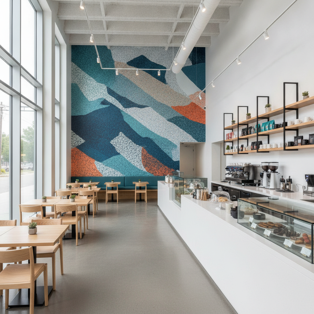
Commercial interior branding is the deliberate use of interior surfaces, graphics, colour, typography, and spatial cues to express a business and support the way people use its space. It includes more than placing a logo behind reception. A considered program can introduce a visitor, guide a customer toward a decision, explain a product, identify a room, reinforce workplace culture, or create a memorable feature worth photographing.
The strongest results begin with the experience rather than the wall. Ask what a visitor should understand at the entrance, where a customer pauses, which route needs clarification, and which surface naturally attracts attention. Those answers determine the message, scale, contrast, and placement.
For example, a restaurant may use a readable brand statement near the queue and a more atmospheric pattern in the dining area. An office may reserve its largest wall for a concise mission statement while using smaller room identifiers along a corridor. A retailer may use graphics to distinguish product zones without making every wall compete for attention.
Ink Blend connects those decisions to production through its commercial branding service. The aim is a coherent environment in which the brand system works with the floor plan, lighting, furniture, sightlines, and day-to-day operations.
Branding is a placement decision, not only an artwork decision
A beautiful file can underperform if it is installed where people do not look, viewed from the wrong distance, or crowded by furniture and signage. Before artwork is finalized, identify the audience, viewing distance, lighting conditions, likely obstructions, and cleaning demands for each surface.
Large type and high contrast generally help at entrances and along circulation routes. More detailed imagery can work where people wait or sit close to the wall. A quiet supporting texture may be better than another statement graphic in a room that already contains menus, displays, screens, or regulatory notices.
Where commercial branding should go inside a space
The most useful way to map a branded interior is to assign each surface a job. A surface may greet, orient, persuade, identify, separate, or create atmosphere. This approach prevents a common mistake: spreading the same logo or mural treatment everywhere without considering how guests move through the room.
Entrances and reception areas
The entry is usually the first opportunity to establish tone. A reception wall, vestibule, or visible side wall can carry the business name, a concise positioning statement, or a distinctive visual that confirms visitors are in the right place.
Measure the approach distance as well as the wall itself. If visitors see the graphic while walking toward it, letter height and contrast need to work from farther away. If the wall is beside a reception desk, the design can support a closer, more detailed read.
Counters, queues, and service points
Customers often make decisions while waiting. A counter backdrop can reinforce a menu category, explain a service, provide a branded photo setting, or make an otherwise functional area feel intentional. Keep essential operational information visually dominant where safety, ordering, or accessibility is involved.
These areas also receive frequent contact and cleaning. Confirm the wall condition and cleaning routine before selecting the production approach, and avoid placing delicate small text behind equipment, dispensers, or displays that may move.
Corridors, columns, and transition zones
Long corridors and columns can connect separate areas of a business. Repeated colours, directional motifs, room names, or short messages can make a route easier to understand without turning it into a gallery of competing statements.
Columns are particularly useful when they are visible from several sightlines. Their curved or interrupted geometry must be measured carefully, and artwork should be composed so a key word or face does not disappear around an edge.
Glass, partitions, and built-ins
Glass graphics can provide privacy, identify meeting rooms, or extend a brand system without blocking natural light. Built-ins, cabinetry, counters, and other non-wall elements may require a different surface treatment or a removable graphic solution.
Ink Blend’s interior design graphics service helps organize these surfaces as part of one visual environment. The production choice should follow the substrate and use case rather than forcing every element into one method.
When UV wall printing fits a commercial interior
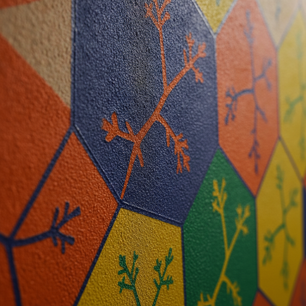
UV wall printing places UV-cured ink directly onto a prepared surface, with the printer aligned to the wall or other compatible area. It is useful when a project needs a seamless large-format image, precise registration around fixtures, crisp close-read detail, or a branded result without installing multiple wallpaper panels.
Direct printing is not automatically the right answer for every wall. The substrate, coating, texture, moisture exposure, age of the paint, access, and desired finish all affect the recommendation. A responsible provider should review these conditions before confirming the production method.
What direct-to-wall UV printing can offer
- Seamless composition: Large artwork can read as one continuous image rather than a series of joined panels.
- Precise placement: Artwork can be aligned to doors, counters, outlets, millwork, and other fixed features.
- Fine detail: Typography, linework, and photographic elements can remain clear when designed for the intended viewing distance.
- Immediate curing: UV-cured ink is cured during printing, supporting an efficient on-site workflow.
- Reduced removal work: Because the design is printed onto the prepared surface, the project may avoid some of the installation and removal steps associated with wallpaper or adhesive films.
- Adaptable visual systems: A brand can extend from a feature wall to supporting surface graphics while maintaining colour and design consistency.
These benefits matter most when the wall is a prominent part of the customer or employee experience. A close-read reception statement, a high-impact restaurant backdrop, and a detailed cultural mural each benefit from accurate alignment and a clean uninterrupted field.
Surface conditions that need review
Prepared painted drywall and many sealed interior surfaces can be suitable, but the wall must be assessed rather than assumed. Fresh paint, deep texture, loose coatings, heavy grout lines, moisture damage, dust, and uneven repairs can affect adhesion, image quality, or the appearance of the finished print.
A photo review can identify obvious concerns, while an on-site inspection or small adhesion test may be appropriate for uncertain surfaces. Ink Blend may recommend preparation, a panel, a surface graphic, or another surface printing solution when direct printing would not deliver a reliable result.
UV printing compared with wallpaper, paint, and panels
ApproachUseful whenPlanning question Direct-to-wall UV printingA seamless, precise graphic is needed on a suitable prepared surface.Is the substrate ready, and will the artwork be legible at the actual viewing distance? Wallpaper or adhesive filmA specific texture, removable layer, or material effect is central to the design.How will seams, edges, cleaning, and future removal be managed? PaintThe goal is a colour refresh or broad field of colour rather than detailed graphics.Does the space need branding information, imagery, or only a new colour environment? Rigid panels or other surface graphicsThe existing surface is unsuitable or a replaceable component is preferred.How will mounting, edges, weight, and access affect the installation?The comparison is not about declaring one method universally superior. The right choice depends on the wall, the message, the operating environment, and the required future flexibility.
How to choose visuals by venue type
Commercial interior branding should reflect what visitors are doing in the space. The same brand can use different messages, image scales, and levels of visual intensity across restaurants, offices, retail environments, hotels, and shared residential spaces.
Restaurants and cafes
Start by mapping the order path: entry, queue, menu or counter, pickup, seating, and exit. A branded wall near the queue can support recognition while a feature behind the counter or in a seating area can provide a strong visual anchor.
Food-service interiors also require practical planning. Keep graphics clear of equipment, menu boards, handwashing fixtures, and required notices. Consider cleaning access, delivery routes, and the hours when a printer, protective coverings, or staging equipment can be present without disrupting service.
Offices and professional spaces
Office branding can support arrival, culture, navigation, and team identity. Reception walls benefit from clear brand recognition; meeting-room identifiers need quick readability; collaboration areas can carry values or visual themes without overwhelming people who work there every day.
Plan around desks, screens, acoustic treatments, electrical outlets, and future furniture changes. A scale mockup helps stakeholders judge whether a statement is appropriately prominent and whether small text will remain useful once the room is furnished.
Retail, salons, and customer-service environments
Retail graphics should support browsing rather than compete with products. Use a feature wall to establish a campaign or identity, then use quieter patterns, category cues, or close-read details where customers pause.
Salons and service businesses often have mirrors, stations, plumbing, displays, and equipment that interrupt a wall. Photographing the room before design begins helps place artwork around those fixed elements and protects the practical flow of the service area.
Hotels, condos, and hospitality spaces
Hospitality environments often need graphics that feel distinctive but remain comfortable over repeated visits. Lobbies may support a memorable statement, while corridors and shared areas may benefit from calmer patterns, local references, or directional cues.
For large-scale concepts, Ink Blend’s custom wall mural service can be considered alongside direct-to-wall production. The design should account for furniture, luggage movement, cleaning, lighting changes, and the way guests photograph the space.
How to plan a commercial interior branding project from photos to print
A clear workflow reduces surprises because artwork, surface conditions, approvals, and site logistics are addressed in the right order. Ink Blend’s project process is organized around discovery, concept development, approval, and on-site production.
1. Gather the information that affects the recommendation
Begin with straight-on photos of each candidate wall, wider room views, approximate width and height, ceiling height if relevant, and close-ups of the surface. Include doors, windows, outlets, counters, fixtures, furniture, and any area that the graphic must avoid.
Also provide the brand files, preferred imagery, intended message, operating hours, access restrictions, and the date by which the space needs to be ready. If the project is in a multi-tenant plaza, include loading information and any building-management requirements.
2. Define the job of each graphic
Decide whether each piece should greet, orient, persuade, identify, educate, or create atmosphere. Then set a priority order. One strong primary statement supported by quieter elements is usually easier to read and maintain than several walls competing at the same visual volume.
Check the message against the audience and viewing distance. A phrase that works on a close-range meeting-room wall may be too small for a reception backdrop. Conversely, oversized copy can feel intrusive in a quiet lounge or corridor.
3. Review scale-accurate concepts
A mockup should show more than a pasted image. It should indicate approximate dimensions, placement relative to architecture, key margins, colour intent, and the relationship between the graphic and existing fixtures. Review it at the distance from which visitors will actually see the wall.
Consolidate feedback before production art is locked. Assign one decision-maker or approval group, identify what is changing, and confirm that the final file reflects the approved version. This avoids conflicting last-minute instructions on print day.
4. Prepare the site and schedule the print window
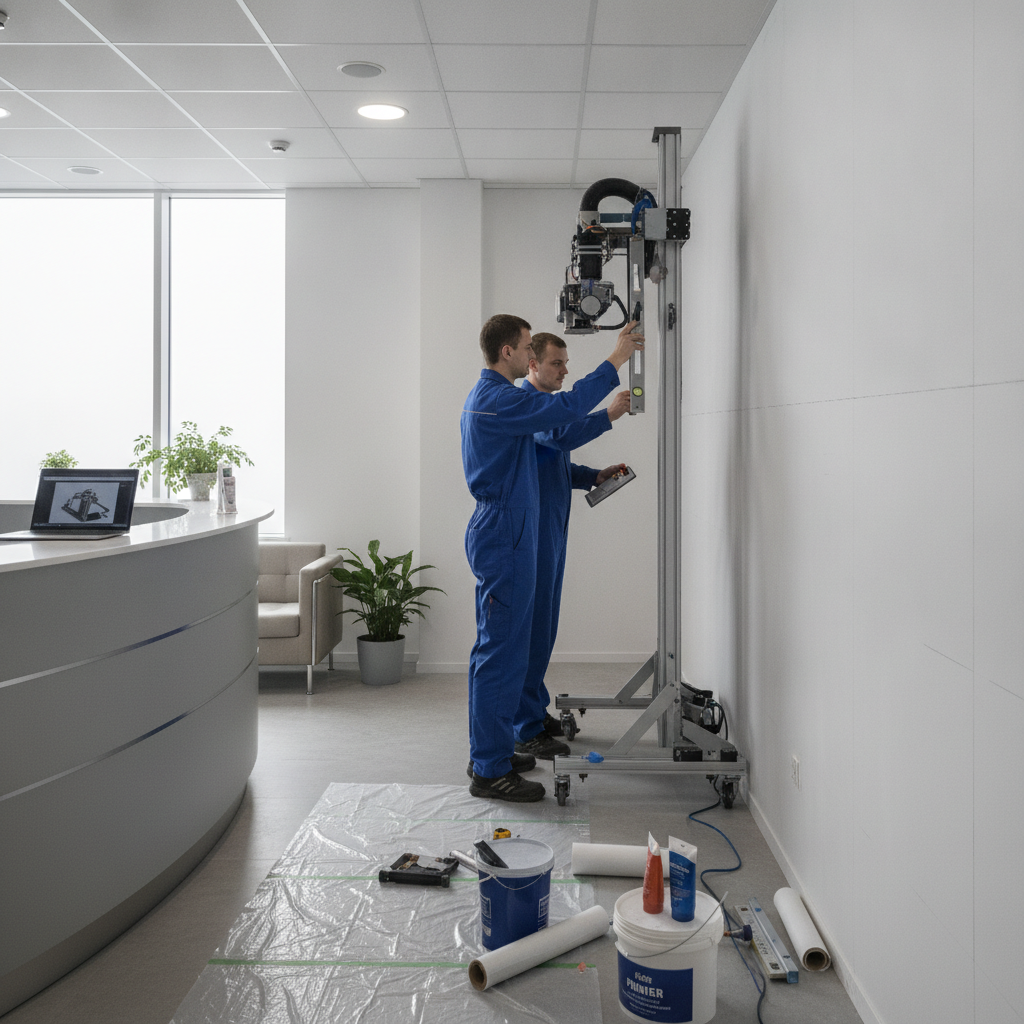
Remove or protect movable items, confirm the wall is ready, and identify a clear route for equipment. Discuss floor protection, masking, ventilation expectations, power, access, and the areas that must remain open. For active businesses, a staggered or off-peak installation window may reduce disruption.
On site, the team positions the printer, prepares the surface as required, checks alignment, and prints the approved artwork. A final walkthrough confirms the visible result and identifies any practical follow-up before the space returns to normal use.
StageProvider responsibilityClient responsibility DiscoverReview photos, measurements, surfaces, goals, and constraints.Share accurate site information, brand files, and operating requirements. ConceptDevelop layout options and show the design at useful scale.Clarify the message, select a direction, and consolidate comments. ApproveFinalize production art, placement, preparation needs, and timing.Confirm the approved artwork, access, site readiness, and schedule. Print and reviewProtect the site, align equipment, print, and complete a walkthrough.Inspect the finished work and confirm operational handover.How to compare commercial interior branding providers in Brampton
A useful comparison looks beyond a portfolio image. Ask how the provider assesses the surface, develops the layout, manages approvals, prepares the site, and handles the realities of an active commercial property.
Compare the production method with the surface
Ask whether the proposal uses direct-to-wall UV printing, wallpaper, adhesive film, paint, panels, or a combination. The provider should explain why the method suits the substrate and the intended use, including cleaning, traffic, detail level, and future changes.
Ink Blend specializes in UV wall printing as part of a broader interior graphics workflow. That specialization can be useful when a project depends on direct printing, precise alignment, and a seamless large-format result, but the final recommendation should still follow the site assessment.
Ask how approvals are made reliable
Find out whether you will receive a scale-correct mockup, how dimensions are documented, and when production art is locked. A vague visual preview makes it difficult to judge type size, furniture conflicts, margins, and the relationship between several walls.
Also clarify who owns final approval. Commercial projects often include an owner, designer, marketing team, site manager, and building representative. A defined review path prevents the installation team from receiving contradictory instructions.
Check operational coordination
Ask how the provider manages loading, protective coverings, equipment placement, customer circulation, and cleanup. Confirm what the client must move or prepare and whether the work can be scheduled around opening hours, deliveries, or high-traffic periods.
These details are especially important when the business cannot simply close. A technically excellent graphic can still create avoidable friction if access, staging, and handover are not discussed early.
Confirm the boundaries of the recommendation
A credible provider should identify unsuitable conditions rather than promise that every surface will print the same way. Ask what happens if a wall is too textured, recently painted, damaged, damp, or interrupted by tile and grout. The answer may be preparation, a panel, a different graphic method, or a decision not to print that area.
Where work affects construction, renovation, occupancy, or a change of use, confirm which project requirements belong to the property team and qualified professionals. Ontario’s Building Code information is the appropriate government starting point for applicable building requirements; it does not replace project-specific professional advice.
Brampton installation logistics that affect the result
Brampton commercial projects may take place in multi-tenant plazas, office buildings, retail units, restaurants, and mixed-use properties. Shared loading doors, elevator bookings, delivery schedules, property-management rules, and narrow customer routes can affect the installation window as much as the artwork does.
Send access photos when possible, including the route from loading or parking to the wall. Note stairs, elevators, door widths, security desks, time restrictions, and areas that must remain open. This allows the team to plan equipment movement and protective measures before arriving.
Plan around customer and staff flow
Restaurants and cafes may prefer a midweek morning window before service begins. Retailers may need work scheduled before opening or after a campaign changeover. Offices may coordinate around meetings, security access, and employees working near the installation area.
Do not assume that a wall is accessible because it is visible. Furniture, displays, queue barriers, stock, and temporary fixtures can change the working area. A current room photo is more useful than an old floor plan alone.
Consider the building and project context
Property managers may require certificates, booking confirmations, protection of common areas, or specific delivery procedures. Ask who will communicate with management and who is responsible for approvals outside the artwork itself.
If the graphic is part of a broader renovation or interior alteration, coordinate it with the design and construction schedule. Surface preparation, millwork installation, lighting, signage, and final cleaning can all affect when a wall is ready to print.
Frequently asked questions about commercial interior branding
What is commercial interior branding?
Commercial interior branding uses walls, glass, fixtures, graphics, colour, and spatial cues to express a business and support how people use its space. It can include reception branding, murals, wayfinding, culture graphics, product storytelling, privacy patterns, and feature walls. The goal is to connect the visual system to real customer, employee, and operational touchpoints.
Is UV wall printing suitable for every interior wall?
No. The wall must be prepared and compatible with the selected printing method. Painted drywall and many sealed surfaces may work, while fresh paint, deep texture, loose coatings, moisture damage, and grout-heavy surfaces may require preparation or an alternative such as a panel or surface graphic.
What should I send for a commercial branding quote?
Send straight-on wall photos, wider room views, approximate measurements, close-ups of the surface, brand files, desired imagery or message, and details about fixtures that must be avoided. Include access restrictions, loading information, operating hours, and your target completion window. These details help the provider assess the project and prepare a more useful concept.
How do I approve a branded wall before it is printed?
Request a scale-accurate mockup showing the artwork in the actual room or against the relevant wall dimensions. Review type size, placement, margins, colour intent, sightlines, furniture conflicts, and the relationship to existing signage. Once the decision-makers approve one version, production art and the installation schedule can be confirmed.
Can commercial interior branding be installed without closing a business?
Often, the work can be planned around operating hours, but the answer depends on access, wall location, site preparation, equipment movement, and the size of the installation. Midweek morning, evening, or staggered windows may reduce disruption for Brampton venues. Share busy periods, delivery times, and areas that must remain open so the schedule can be planned realistically.
Start your Brampton commercial interior branding project
Commercial interior branding works best when the message, surface, layout, and installation plan are considered together. Send Ink Blend wall photos, rough measurements, artwork or brand direction, and your operating constraints to begin a practical review of the opportunity.
Request a project conversation with Ink Blend and plan a branded interior that is clear, durable, and built around how your space is actually used.