
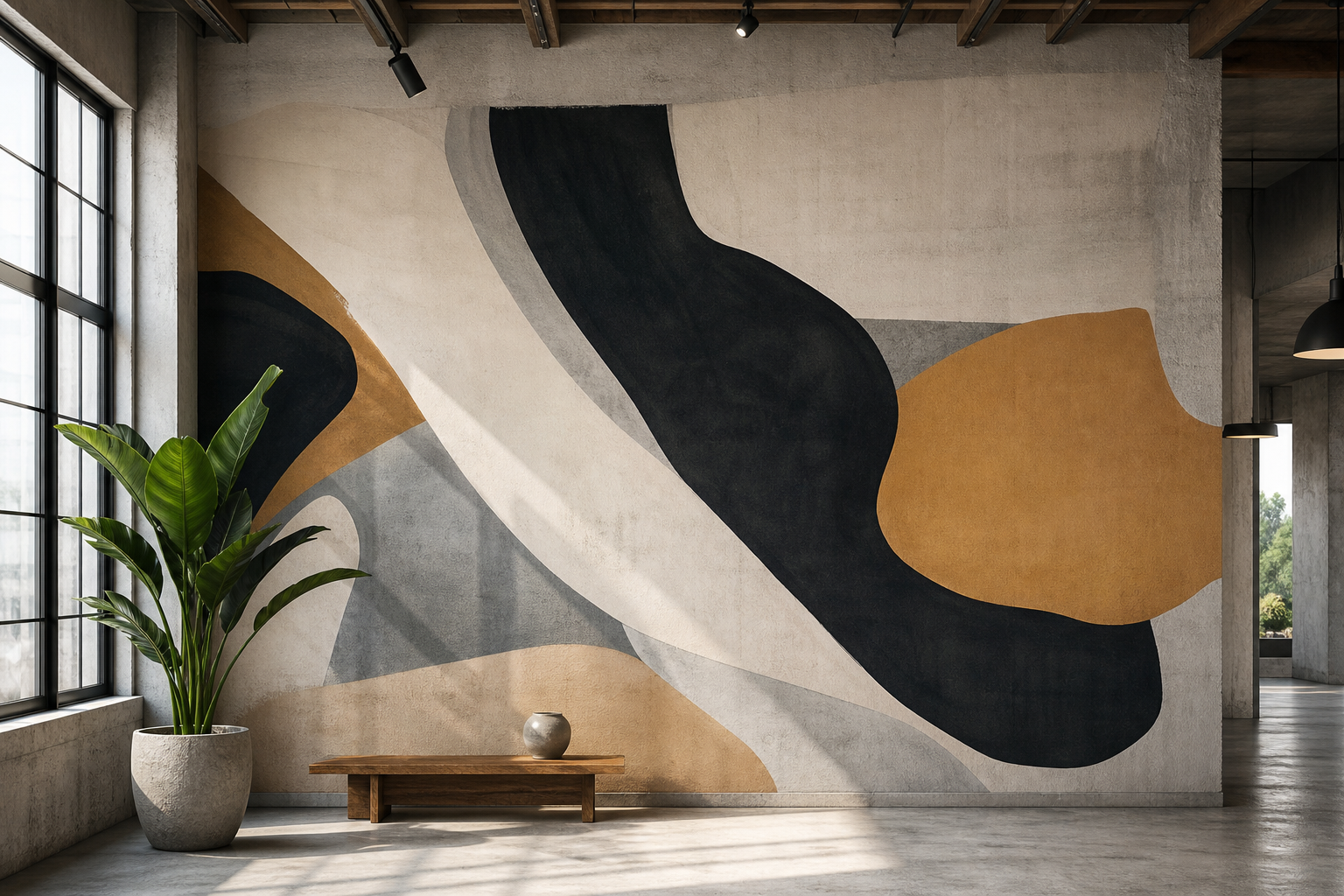
Mural mockup examples for real spaces: layouts, scale checks, and surface notes
Explore mural mockup examples with practical guidance, key questions, and clear next steps before you contact Ink Blend or make a decision.
If you need to communicate how a large artwork will live on an actual wall, strong mural mockup examples do the heavy lifting. A good mockup doesn’t just look pretty—it proves placement, scale, legibility, and how the design relates to doors, windows, furniture, and lighting. Below you’ll find practical ways to build persuasive visuals that help teams align quickly and approve with confidence.
Why mockups matter for walls of any size
Murals are read at distance, lived with daily, and anchored by real‑world constraints like sightlines, trim, and traffic flow. A flat artwork file rarely answers the questions stakeholders have. A clear mockup:
- Shows how the design lands on the exact wall, not a generic canvas.
- Proves scale with measurements and reference objects people recognize.
- Surfaces risks early—cropping, obstruction by fixtures, glare pockets, or code signage areas that must remain clear.
- Helps compare options (placement, colour intensity, edge crops) without guesswork.
- Becomes the source of truth for approvals, production, and on‑site positioning.
Quick workflow to create a solid mural mockup
- Capture straight‑on wall photos. Shoot level and centred when possible. Add oblique angles too for context and sightlines from entries or seating.
- Measure once, write it on the image. Record total width and height, plus key distances (to doors, thermostats, baseboards). Overlay at least two confirmed dimensions on the photo.
- Block the safe print area. Draw a rectangle for the planned art zone, offsetting from corners, trim, and outlets to reduce visual crowding.
- Place art in perspective. Use perspective transform so the artwork matches the wall plane. Avoid simply scaling in 2D; it misleads on proportion.
- Set a realistic scale. Calibrate by matching one known on‑site measurement (e.g., door height) to your mockup so type sizes and motifs are honest.
- Note surfaces and seams. Brick, textured plaster, or panel seams may affect fine lines. Add a short note layer where texture is most visible.
- Check lighting. Indicate directional light, hotspots, or shadow bands where contrast or gloss may appear different.
- Export options A/B/C. Provide at least two variations (e.g., tighter crop vs. breathing room; brighter palette vs. muted). Keep labels simple: Option A/B/C.
Mural mockup examples by space type
Use these scenario‑based prompts to build mockups that answer the questions each environment typically raises.
-
Restaurants and cafes
- Feature wall behind seating: Centre a primary motif between sconces, leave 10–20 cm clearance above banquettes, and show how the design repeats or fades behind table groupings.
- Menu typography wall: Prove legibility from 2–4 m with a text size callout and a cropped detail at 100% scale.
- Photo backdrop nook: Show a vertical composition with head‑to‑toe framing lines to confirm selfie‑friendly placement.
-
Retail and salons
- Brand pattern behind POS: Provide a low‑contrast version that won’t fight pricing signage; include a glare note if pendant lighting is strong.
- Fitting room corridor: Demonstrate a repeating tile with a half‑tile offset at starts/ends to avoid awkward slivers.
- Shelf adjacency: Mark shelf heights and leave negative space where products or mirrors interrupt the sightline.
-
Offices and corporate
- Reception statement: Align key elements to desk centreline; verify camera‑friendly backdrop by testing a 16:9 crop within the mockup.
- Culture wall in corridor: Use a rhythm of panels or milestones with 1:1 spacing; add an arrow noting traffic direction so copy faces the flow.
- Meeting room: Keep focal graphics off main presentation wall to avoid distraction; demonstrate a calmer texture or gradient.
-
Hospitality and condos
- Lobby scale check: Place a human silhouette at average height to show impact under double‑height ceilings.
- Elevator lobbies: Mock door‑open and door‑closed states so cropping remains intentional in both views.
- Amenity spaces: Compose wide, restful fields with subtle detail where residents linger; indicate seating clearances.
-
Residential
- Living room feature: Float the artwork 10–15 cm above trim lines; show the relationship to TVs or frames hung nearby.
- Kids’ rooms: Keep friendly focal elements between 60–120 cm from the floor; include alternative colourways for future updates.
- Hallways: Demonstrate a continuous frieze or band at eye level to guide movement without closing in the space.
-
Cultural and educational
- Timeline murals: Set a modular grid where dates and captions sit consistently; include a 100% detail crop for small text.
- Wayfinding integration: Reserve clear space where directional arrows or labels must sit, shown as translucent overlays.
- Exhibit backdrops: Provide both empty‑room and visitor‑crowd simulations to ensure visibility above typical head heights.
-
Events and pop‑ups
- Branded photo wall: Test logo size against phone camera framing; include a 9:16 portrait guide and step‑back distance note.
- Merch corner: Balance pattern density so products remain the hero; show racks or plinths overlaid.
- Temporary corridors: Use bold, high‑contrast graphics with large arrows; simulate low light to check readability.
Layout and composition ideas that translate well at scale
- Edge‑to‑edge wrap: Full‑bleed compositions feel intentional and modern; show how they meet corners and ceilings.
- Framed focal: A large central element with soft margins provides breathing room in busy spaces.
- Banding or frieze: A horizontal strip at eye level guides movement in corridors without overwhelming.
- Diptych/triptych: Break long walls into panels with consistent gutters to manage doors and switches elegantly.
- Typography wall: Use generous line spacing; test a 3–5 m viewing distance in the mockup for legibility.
- Pattern repeat: Show the repeat tile and how it resolves at edges to avoid tiny slivers.
- Gradient or texture field: Helpful where reflections are common; soft transitions hide minor surface variations.
- Negative space anchoring: Intentionally leave quiet areas where furniture or signage will sit.
Scale and measurement checks stakeholders expect to see
- Known objects as rulers: Doors, chairs, or a 2x2 ceiling tile instantly communicate size better than abstract numbers.
- Dimension overlays: Add clear width/height callouts and offsets from edges; include units and decimals sparingly.
- 100% detail crops: Provide one zoomed area showing texture, fine lines, or small type at real output size.
- Viewing distance notes: Indicate expected reader distance ranges in lobbies, corridors, seating areas, or queues.
- Clearance boxes: Draw translucent boxes around fire pulls, thermostats, and electrical panels that must remain accessible.
Surface and lighting considerations worth noting on the mockup
- Texture impact: Brick, block, orange‑peel, or woodgrain can soften small text and hairlines; favour thicker strokes and higher contrast.
- Seams and breaks: Columns, panel joints, or railing returns can split key elements—slide focal points away from interruptions.
- Glare and hotspots: Downlights and windows can wash out pale colours; test darker or more saturated variants in those zones.
- Corner wraps: If continuing around a corner, preview the wrap and ensure key lines align at the bend.
- Baseboard and crown: Keep a consistent offset so the artwork doesn’t feel cramped against trim.
File prep and export notes that make production smoother
- Organize layers: Separate background photo, artwork, measurements, and notes. Lock the photo to prevent accidental scaling.
- Colour consistency: Include a small swatch strip with hex/CMYK values on the mockup for reference across versions.
- Resolution awareness: Confirm that the original artwork supports the intended output size, especially for fine detail.
- Edge bleed and safe areas: Show a thin outline for final trim/crop and keep crucial elements inside a safe margin.
- Versioning: Name files clearly: Project_Space_OptionA_Date. Export both a layered source file and a flattened PDF/JPG for review.
- Accessibility and contrast: If text is present, include a quick contrast note so copy remains readable in ambient light.
Stakeholder approval checklist to include on the last slide
- Wall dimensions and final art size confirmed.
- Offsets from edges, doors, outlets, and fixtures confirmed.
- Colourway selected and swatch values recorded.
- Surface texture acknowledged with any adjustments noted.
- Lighting conditions reviewed; hotspots or reflections considered.
- Installation date window and site access considerations captured.
- Final export filename and version date listed for reference.
Common pitfalls to avoid in mural mockups
- Ignoring perspective: Flat pastes look fine on slides but fail to predict real‑world proportions.
- Over‑busy edges: Crowding corners and trim makes high‑end spaces feel cramped; add breathing room.
- Tiny type at distance: What reads on a laptop may disappear on a corridor wall—always show a 100% detail.
- Unmarked obstructions: Fire pulls, thermostat screens, and access panels routinely end up on top of motifs if not mapped.
- One‑option presentations: Provide at least one alternate scale or crop so teams can choose rather than hesitate.
- Exporting only dark‑room renders: Simulate ambient light; daylight can flatten pale gradients and metallic tones.
FAQ
How realistic do mural mockup examples need to be?
They should be realistic enough to prove scale and placement. That means perspective‑matched artwork on the actual wall photo, at least two dimension callouts, and a 100% detail crop. Hyper‑photoreal lighting is helpful but not mandatory if you annotate glare or shadow risks.
What if the wall colour or finish changes after I mock up the design?
Include a neutralized, greyscale version of the wall in one slide so stakeholders evaluate composition and scale independent of paint colour. If finishes change, quickly re‑tint that base and re‑export the options; keep your artwork layers separate so swaps take minutes, not hours.
Do I need exact measurements before presenting to stakeholders?
Provisional mockups can move discussions forward, but you should confirm at least one hard measurement (e.g., overall width or door height) to calibrate scale. Before final approval, verify full width, height, and offsets to fixtures so production and on‑site placement match the plan.
How do I handle curves, niches, or stepped walls?
Photograph straight on and at 45° to capture geometry. In the mockup, outline the irregular edges, then position the focal content within the largest continuous plane. Provide an oblique view slide to show how the composition reads as people approach.
Should I mock up painted and printed executions differently?
Present the same composition, but add a short note about detail tolerance. For hand‑painted looks, simplify micro‑detail and emphasize shapes and contrast. For printed looks, include a 100% crop to show texture interaction and fine line clarity.
Ready to turn your wall photos into clear, approval‑ready visuals? See examples and next steps at https://www.inkblend.ca/.
A practical next step
To discuss the options that apply to your situation, contact Ink Blend and request the relevant details before moving forward.