
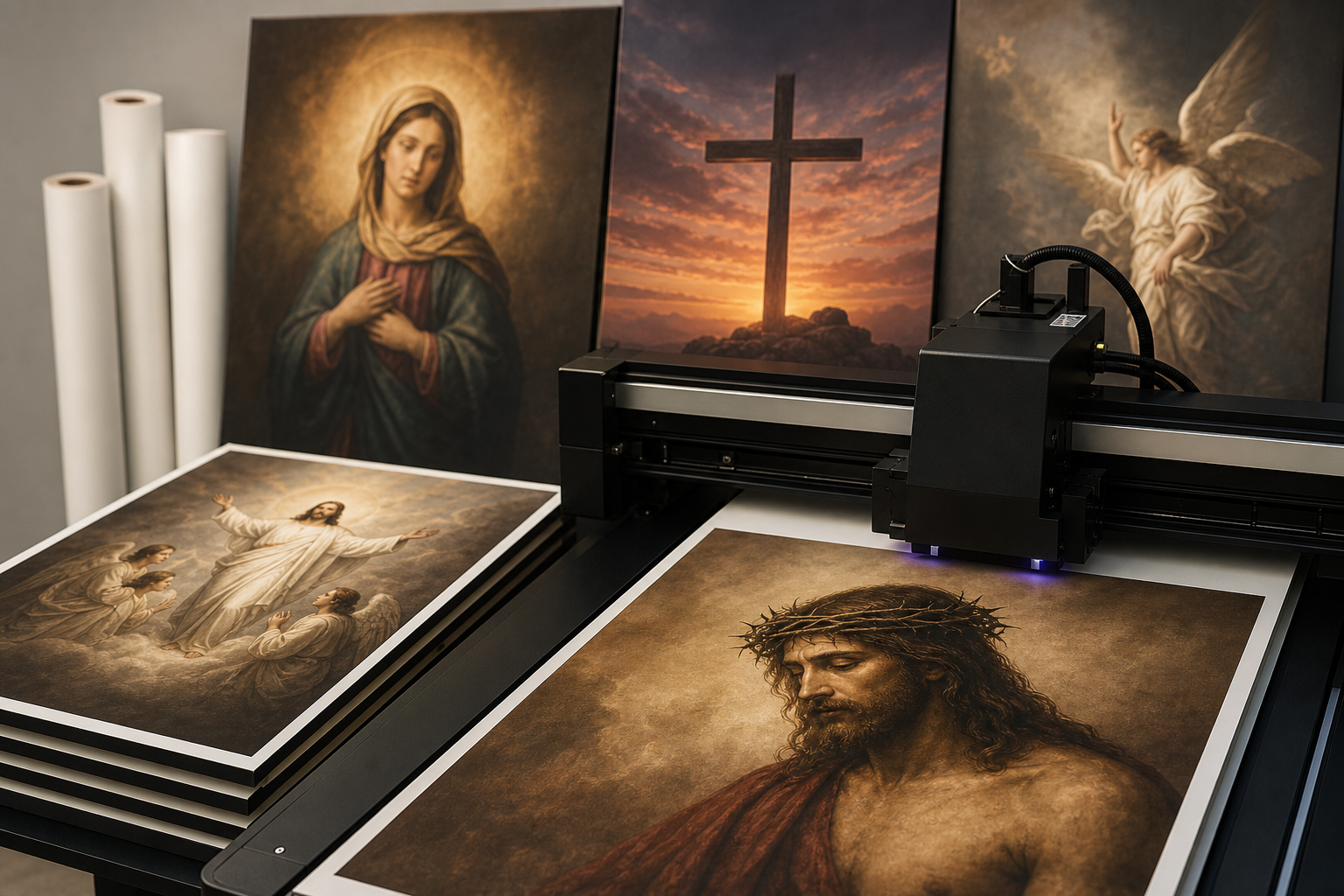
Religious artwork printing: formats, quality checks, and respectful display
Explore religious artwork printing with practical guidance, key questions, and clear next steps before you contact Ink Blend or make a decision.
Religious images carry deep meaning, so decisions about printing them deserve care. Whether you are preparing a feature wall for a house of worship, a small framed print for home devotion, classroom visuals, or a travelling exhibit, the choices you make before a single drop of ink is laid down will shape the outcome. This guide presents a clear path through the planning, file preparation, material selection, production checks, placement, and maintenance that lead to a respectful and visually strong result for religious artwork printing.
Set intent and stakeholders
Start by defining the purpose of the piece and who should be involved in decisions. Clear intent helps you right-size the budget, select the correct format, and avoid revisions later.
- Purpose: devotion, education, commemoration, wayfinding, fundraising, or seasonal display.
- Audience: congregants, visitors, students, interfaith guests, or the general public.
- Setting: sanctuary, chapel, lobby, classroom, gallery wall, or outdoor-adjacent vestibule (still protected).
- Duration: permanent installation, semi-permanent rotation, or short-term event.
- Approvals: clergy, facility managers, art committees, educators, or donors.
Document the decisions in a short brief: objectives, placement, size range, any symbolic constraints (for instance, required inscriptions, iconographic colours, or orientation), and the review path for final sign-off.
Permissions, tradition, and sensitivity
Faith traditions can have specific norms about representation, placement, or inscriptions. Aligning the artwork with those norms protects meaning and reduces the chance of rework.
- Tradition check: confirm whether particular subjects or styles are recommended or restricted for your community and context.
- Text fidelity: verify sacred text excerpts and transliterations. Use community-approved translations and check diacritics and typographic conventions.
- Language hierarchy: if multiple languages appear, agree on size relationships and reading order in advance.
- Review cycle: schedule a content review with appropriate leaders or committees before production.
Respect also extends to image sourcing. Using licensed, public-domain, or commissioned artwork with clarity about rights avoids legal issues and honours creators.
Image sourcing and rights
Great prints begin with lawful, high-quality source images. Consider these common paths:
- Commissioned work: partner with an artist or photographer for a custom piece tailored to your space.
- Licenced images: purchase from reputable libraries that provide documented rights for print usage and size.
- Public domain: classical works or images whose copyrights have expired—verify status through credible sources and collect attribution notes if desired.
- Community archives: digitize historical pieces you own. Secure written permission from the rights holder if ownership is shared or unclear.
Keep a folder of rights documentation (licence, artist agreement, or public-domain confirmation). Note any attribution text that must appear near the piece or on a plaque.
File prep, resolution, and colour
File preparation is the most controllable lever for quality. Address these factors before you think about substrates or printing methods.
- Resolution targets: for close viewing of framed prints, aim for native artwork that resolves cleanly at print size. For very large pieces viewed from several metres away, moderate native resolution can still look crisp; however, avoid excessive upscaling that creates softness or halos.
- Vector vs. raster: where possible, use vector files (SVG, EPS, PDF) for typography, calligraphy, and line art so edges remain sharp at any size. Keep photographic elements as high-resolution raster.
- Colour management: request a soft proof from your designer or prepress contact and a small hard proof on the intended material when colour fidelity (for example, iconographic hues or liturgical colours) is critical.
- File packaging: embed or outline fonts, include linked assets, and name layers for languages or variants to simplify approvals.
- Retouching ethics: remove dust, scratches, or lens noise while preserving original character; avoid edits that change sacred symbols or historical integrity.
Choosing a print format
The right format balances reverence, legibility, durability, and budget. Below are common options with practical considerations.
- Canvas gallery wraps: familiar, soft-sheen presentation; works well for portraits, icons, and narrative scenes. Consider float frames to elevate the finish.
- Fine-art paper with framing: maximum control over glass type (matte, museum, or standard), mats, and archival mounting; excellent for prints with delicate tonal transitions and calligraphy.
- Metal panels: modern, rigid, and easy to clean; strong choice for bold colours and high-contrast imagery in high-traffic spaces.
- Acrylic face-mounts: luminous depth and contemporary look; good for bright spaces where reflections are acceptable.
- Fabric banners and tapestries: lightweight, portable, and gentle in tone—useful for seasonal messages or processional art.
- Wall decals and films: contour-cut scriptural verses or symbols; quick to install and remove; mind texture and paint compatibility.
- Direct-to-wall UV printing: prints artwork directly onto prepared interior surfaces for a seamless, mural-like result; helpful when you want scale without seams or frames. Evaluate surface smoothness and priming before choosing this route.
- Panels as murals: produce large images on multiple rigid panels to span wide walls while preserving future removability.
Match the finish to the setting: low-gloss or matte for contemplative spaces; higher-gloss options for lobbies where vibrancy is welcome and reflections are manageable.
Scale, layout, and legibility
Because religious artwork often mixes imagery with text, plan the composition for your exact wall or frame size.
- Viewing distance: size text so the smallest characters remain readable from the expected standing or seating position.
- Hierarchy: give primacy to central figures or verses; use scale and spacing to guide the eye.
- Margins and breathing room: leave adequate white space so the piece feels integrated rather than cramped against corners or ceilings.
- Lighting: map ambient and directional lights; avoid glare on glossy finishes and check how colours appear under warm or cool fixtures.
- Accessibility: maintain contrast for legibility, choose typefaces with clear character shapes, and ensure mounting heights work for seated and standing viewers.
Material and surface checks
Durability and cleanliness affect how the piece lives day-to-day. Consider the realities of your space before committing.
- Traffic level: in corridors or multipurpose halls, select scuff-resistant finishes and mountings that resist tampering.
- Environmental factors: humidity near entrances or fluctuating temperatures in older buildings may influence substrate choice and mounting hardware.
- Wall condition: for murals or direct-to-wall printing, ensure the wall is smooth, clean, and fully cured if recently painted. Patches, texture, and contaminants will show through.
- Cleaning: confirm the appropriate cleaning method for your chosen finish (dry microfiber, gentle damp wipe, or professional care for framed works).
Proofing and approvals
Proofs convert assumptions into facts. Build a brief approval path to lock the design before production.
- On-screen mockups: present the art to scale on a photo of the wall, with dimensions called out. This helps committees visualize placement and size.
- Swatch proof: when colour fidelity is important, request a small print on the final material. Compare under the same lighting the piece will have in situ.
- Content checklist: verify spellings, diacritics, verse numbering, and attribution. Keep a final PDF proof with approval signatures or emails.
Installation and safety
Installation should protect both the artwork and people working around it. Plan logistics early, especially in active facilities.
- Mounting hardware: choose anchors and cleats rated for the weight and wall type. For multi-panel works, use a levelled rail system to maintain alignment.
- Heights and clearances: centre framed works at a consistent eye line; keep adequate clearance from lit candles, HVAC vents, and doors.
- Site coordination: schedule work outside of services, classes, or events. Protect floors and nearby furniture during installation.
- Future access: for seasonal or rotating pieces, label hardware and store templates for quick re-hangs.
Care and longevity
A simple maintenance plan keeps prints looking their best.
- Routine dusting: use a clean, dry microfiber cloth; avoid cleaning sprays on open prints.
- Spot cleaning: for rigid panels, lightly dampen a soft cloth with water only; test an inconspicuous area first. Do not use abrasives.
- UV exposure: if a wall receives strong direct light, prefer materials and finishes that mitigate fading, or adjust lighting.
- Handling: wear cotton or nitrile gloves when moving framed or panelled pieces to prevent fingerprints and smudges.
Budget and timeline
Religious artwork printing projects vary widely in cost and lead time based on size, material, finishing, and installation complexity. While every project is unique, you can prevent surprises with a basic plan.
- Scope first: confirm finished size, material type, and mounting approach before requesting estimates.
- Artwork readiness: allocate time for rights clearance, retouching, translation checks, and committee approvals.
- Proof windows: allow time for a material swatch or scaled proof when colour is sensitive.
- Installation day: factor in access, lifts or ladders, and protective covering of floors and pews/seating if needed.
Building in buffers around holidays, festivals, or school terms can reduce scheduling conflicts for both the facility and the production team.
Common pitfalls to avoid
- Skipping rights verification: uncertainty here can derail a finished piece late in the process.
- Underestimating text size: scripture or dedications that read well on screen may be too small on the wall.
- Ignoring lighting and glare: even a perfect print can underperform if placed opposite strong glare or in underlit corners.
- Rushing wall prep: texture, dust, or uncured paint can compromise adhesion and print quality for murals and decals.
- Unplanned cleaning: selecting a finish that requires care your team cannot provide leads to premature wear.
Quick spec checklist
Use this list as a last look before you greenlight production.
- Intent and placement documented, with approvals and any tradition-specific notes.
- Source image rights verified; attribution text and licences on file.
- Resolution and scale confirmed for viewing distance; vector text where possible.
- Colour proof or swatch reviewed under in-situ lighting when needed.
- Material and finish selected for traffic and cleaning realities.
- Wall or mounting surface prepped; hardware plan finalized.
- On-screen mockup and final PDF proof signed off.
- Installation logistics scheduled with site coordination.
FAQ: religious artwork printing
What resolution do I need for a large sanctuary mural?
Think in terms of viewing distance. For pieces viewed at several metres, moderate native resolution can still look sharp, especially for painterly or textured works. Keep text and line art as vector so edges remain crisp at any size, and avoid aggressive upscaling that introduces halos or blur. When colour and detail are critical, request a small test print on the intended material.
Do I need permission to print a famous icon or photograph?
Only if it is not in the public domain or if a specific rights holder controls reproduction. When in doubt, obtain a licence or written permission, and save it with your project records. If a work is in the public domain, you may still wish to credit the artist and source as a courtesy.
What’s the difference between direct-to-wall UV printing and wallpaper or decals?
Direct-to-wall UV printing applies ink to a prepared interior surface for a seamless, mural-style look without seams or paste. Wallpaper and decals add a separate layer to the wall, which can be helpful when removability or texture coverage is a priority. The best choice depends on wall condition, desired permanence, finish preference, and installation logistics.
A practical next step
To discuss the options that apply to your situation, contact Ink Blend and request the relevant details before moving forward.